Colour
Colour defines the primary, danger, success, warning, and gray palettes, with guidelines for their use in backgrounds, buttons, and text to ensure contrast, readability, and consistency.
MYDS divides the colour palettes into two (2) categories:
- Primitive colour: Base colours that remain consistent across both light and dark modes.
- Colour tokens: Dynamic colours that adjust according to the mode / theme (light or dark).
Primitive colour
Primitive colours are base colours used throughout the design system but do not have a corresponding dark mode variant. For colour usage that adapts to dark mode, please refer to the Colour Tokens set.

- Primitive colour preview
- Primitive colour name
- Primitive colour HEX value
- Colour tokens
White
Perfect for backgrounds that provide clarity.

Gray
Base colour for gray. Typically used for heading, text and backgrounds. For subtle effect, ideal for use in placeholder text, descriptions, dividers, outlines, and backgrounds.

Primary
This colour is used in selected links, tabs, primary buttons, and any elements that need highlighting.

Note
If the product does not utilize this primary blue as the main colour, consider creating a separate colour palette.
Danger
Indicates critical issues or errors. Perfect for error messages, delete buttons, and urgent alert boxes.

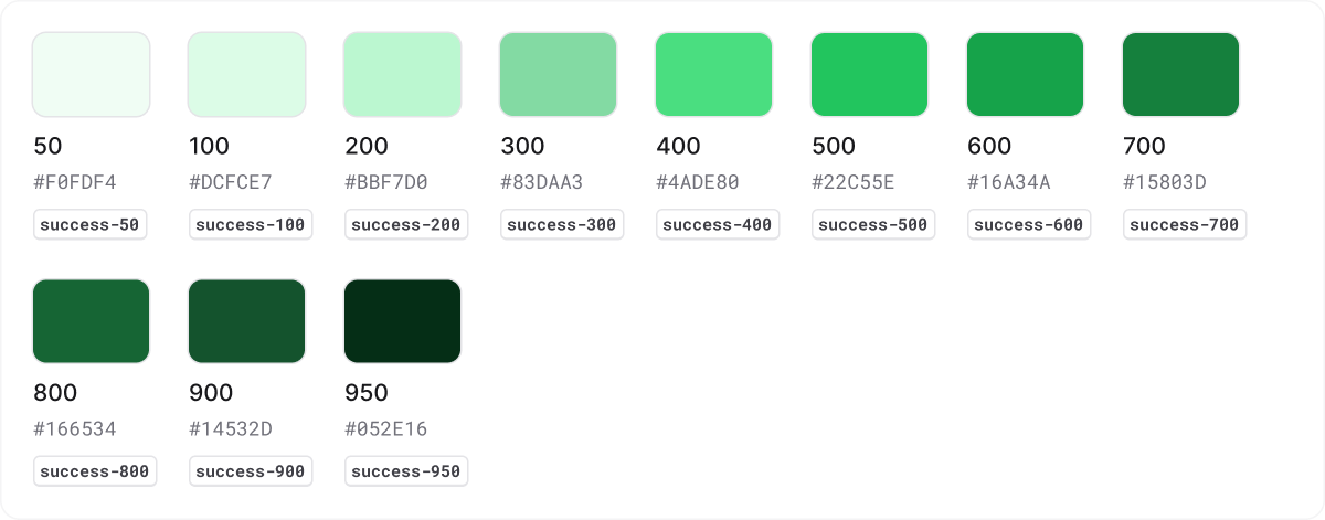
Success
Signals successful actions or outcomes. Ideal for success messages, confirmation pop-ups, and progress indicators.

Warning
Used for cautionary messages and alerts. Ideal for warning banners, notification badges, and alert icons.

Colour tokens
Light mode
Colour tokens are a purposeful set of styles built for darker interfaces. They ensure high contrast for readability and adhere to WCAG 2.1 contrast ratio guidelines, promoting accessibility for all users. Developers can use these tokens to seamlessly integrate accessible colours in both light and dark designs.

- Colour tokens preview (Background, Text, Outline, Focus Ring)
- Colour tokens name
- Colour tokens reference from Primitive colour.
- Colour tokens: “bg-” = Background “txt-” = Text “otl-” = Outline “fr-” = Focus ring
Background
Background tokens define the foundational colours for surfaces and containers. They ensure proper contrast and visual hierarchy across different components.


Text
Text tokens are used for all types of text elements, ensuring legibility and accessibility. They are optimized for readability in various states and modes.


Outline
Outline tokens define the colours for borders and outlines, creating clear separations and accents for UI components.


Focus Ring
Focus ring tokens provide the necessary emphasis on interactive elements when they receive keyboard focus.

Dark mode
Colour tokens are a purposeful set of styles built for darker interfaces. They ensure high contrast for readability and adhere to WCAG 2.1 contrast ratio guidelines, promoting accessibility for all users. Developers can use these tokens to seamlessly integrate accessible colours in both light and dark designs.

- Colour tokens preview (Background, Text, Outline, Focus Ring)
- Colour tokens name
- Colour tokens reference from Primitive colour.
- Colour tokens: “bg-” = Background “txt-” = Text “otl-” = Outline “fr-” = Focus ring
Background
Background tokens define the foundational colours for surfaces and containers. They ensure proper contrast and visual hierarchy across different components.


Text
Text tokens are used for all types of text elements, ensuring legibility and accessibility. They are optimized for readability in various states and modes.


Outline
Outline tokens define the colours for borders and outlines, creating clear separations and accents for UI components.


Focus Ring
Focus ring tokens provide the necessary emphasis on interactive elements when they receive keyboard focus.
